Case Study #5 Financial Analytics Dashboard for ProActive Work Health Services

Case Study #5 Financial Analytics Dashboard for ProActive Work Health Services
A healthcare provider network with 24 clinics in three states and several EMRs could not see where its money came from. Revenue, cost and claim data lived in separate systems. A Financial Analytics Dashboard in Alana Analytics put revenue trends, profit margins, claim ratios and a three-month forecast on one screen.
ProActive Work Health Services is an occupational health provider network with more than 24 clinics across three states. It serves employers, private patients and workers’ compensation cases, and its service lines run from diagnostic examinations and medical imaging to toxicology and medical supplies. The clinics work on several EMR systems, which is why finance leaders needed one place to see revenue, cost and profit by service line, location, insurance type and provider.
Challenge: Plenty of Data, Little Financial Visibility
Twenty-four clinics, three states, multiple EMRs and three very different payer types produce a lot of numbers. What they did not produce was an answer to a simple question: which services, locations and providers actually make money, and which cost more than they bring in?
1. Complex Revenue Streams
Revenue came in from employer services, private insurance and workers’ compensation, spread over service groups such as diagnostics, toxicology and medical supplies. Every combination of payer and service behaved differently, so tracking revenue meant stitching together reports from billing, claims and accounting, and the picture was out of date by the time it was finished.
2. Limited Profit Visibility
Leadership could see total revenue, but not margin. Nobody could say with confidence which service lines, clinics or providers drove the highest profit and which carried the highest cost. Investment decisions were made on instinct and on last quarter’s spreadsheet.
3. Inefficient Revenue Cycle Processes
Claim submission, collection periods and clean claim ratios varied from clinic to clinic. Without one place to watch net collection rate (NCR) and clean claim ratio (CCR), denials were found late and slow collections went unnoticed until cash flow felt it.
4. Forecasting and Planning Gaps
Finance leaders had no reliable way to project revenue for the coming quarters. Budgets and staffing plans were built on rough estimates, which left little room for planning ahead and meant most decisions were reactive.
Solution: One Dashboard for Revenue, Profit and Forecast
MarraTech built a Financial Analytics Dashboard in Alana Analytics for the network. The work ran in three steps: data integration, dashboard design and a pilot rollout. Four objectives set the scope:
- Consolidate financial data into one real-time view of revenue, cost and profit margin.
- Use net collection rate (NCR) and clean claim ratio (CCR) to cut claim denials and shorten the billing cycle.
- Give leadership a forecasting tool to project revenue and spot growth opportunities.
- Benchmark providers and service lines so strong performers can be copied and weak spots fixed.
1. Data Integration and Standardization
- We pulled billing systems, claim processing platforms, EHR data and accounting records into one Alana Analytics data source.
- Financial metrics (revenue, profit, average revenue per claim) and operational KPIs (NCR, CCR, unique claim numbers, average collection period) were defined once, so every comparison uses the same definitions.
- Strict user permissions and HIPAA-compliant protocols protect financial and patient-related information.
2. Dashboard Design and Development
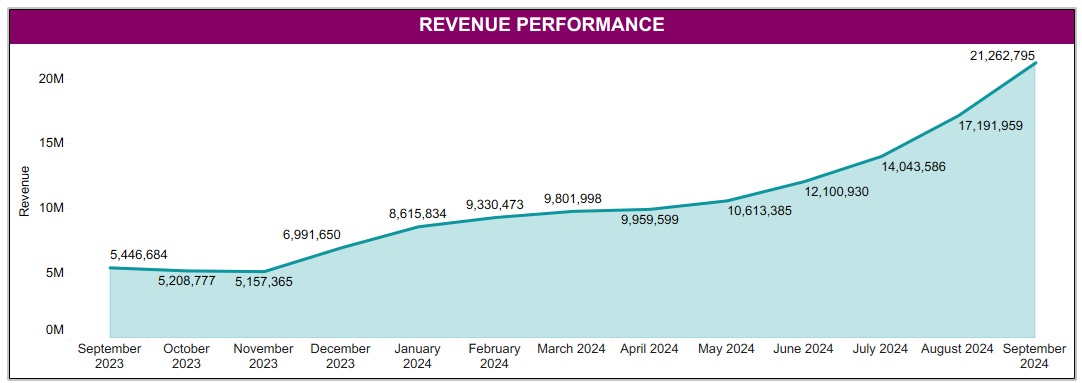
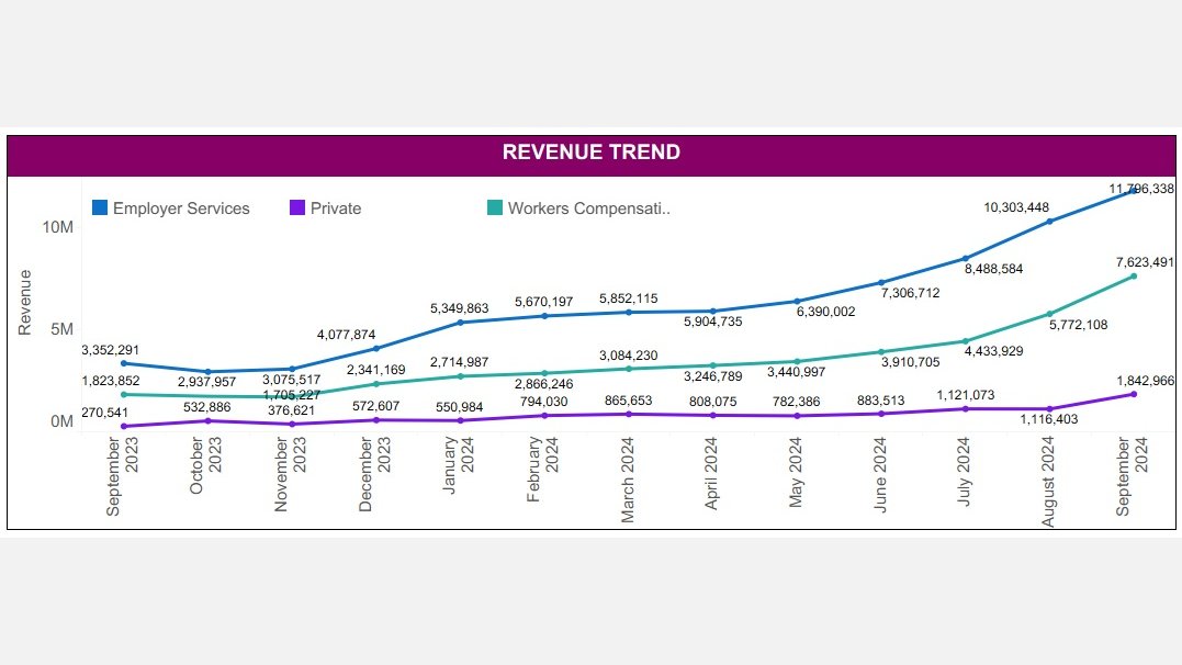
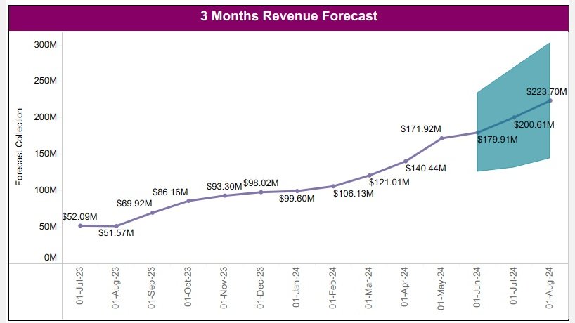
- A revenue performance overview shows total revenue over time, month over month changes and a three-month forecast for short-term planning.
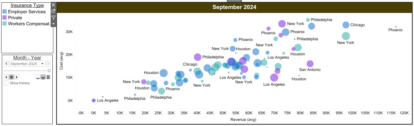
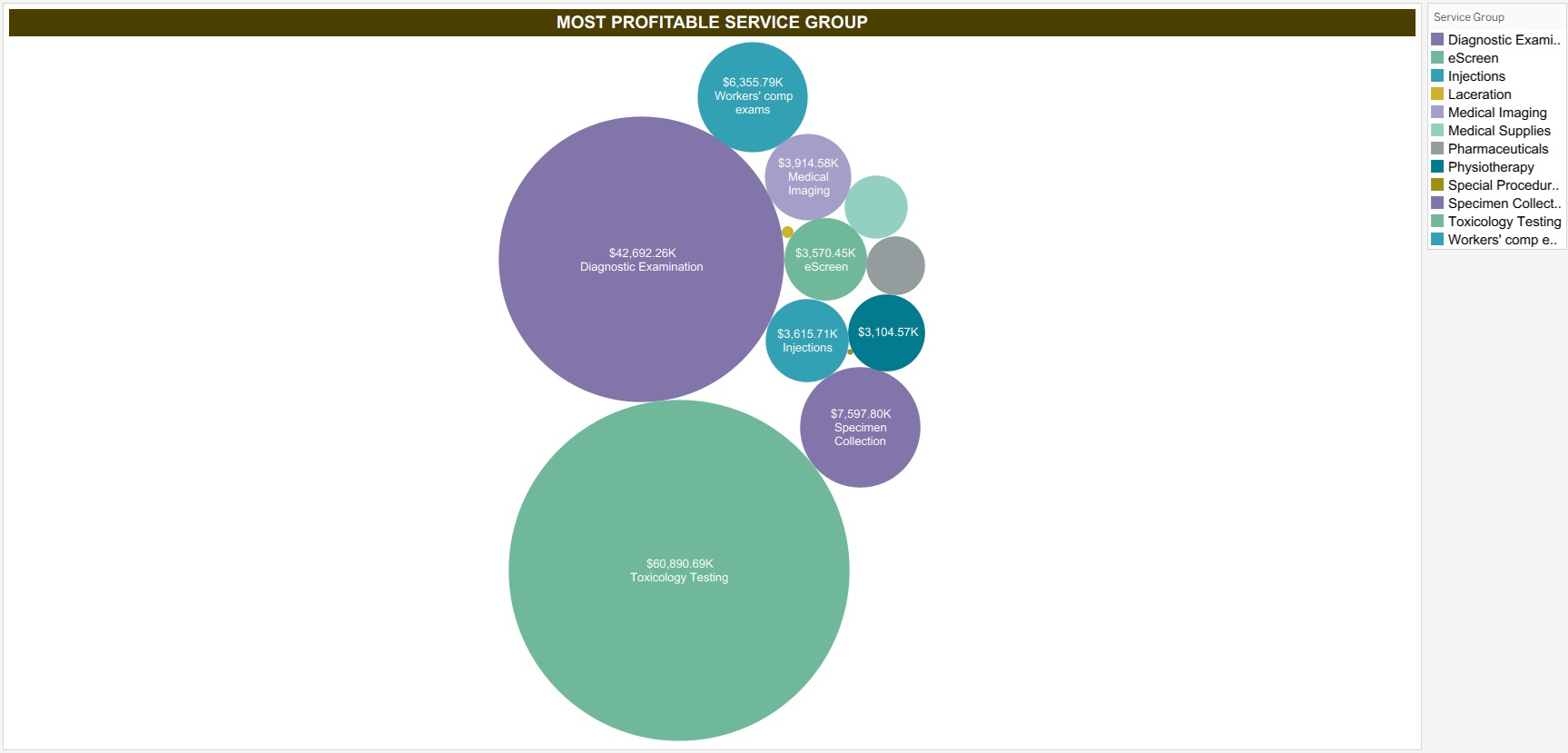
- Revenue trend charts (line, bar and bubble) show revenue by location, service group and plan, with an interactive forecasting model.
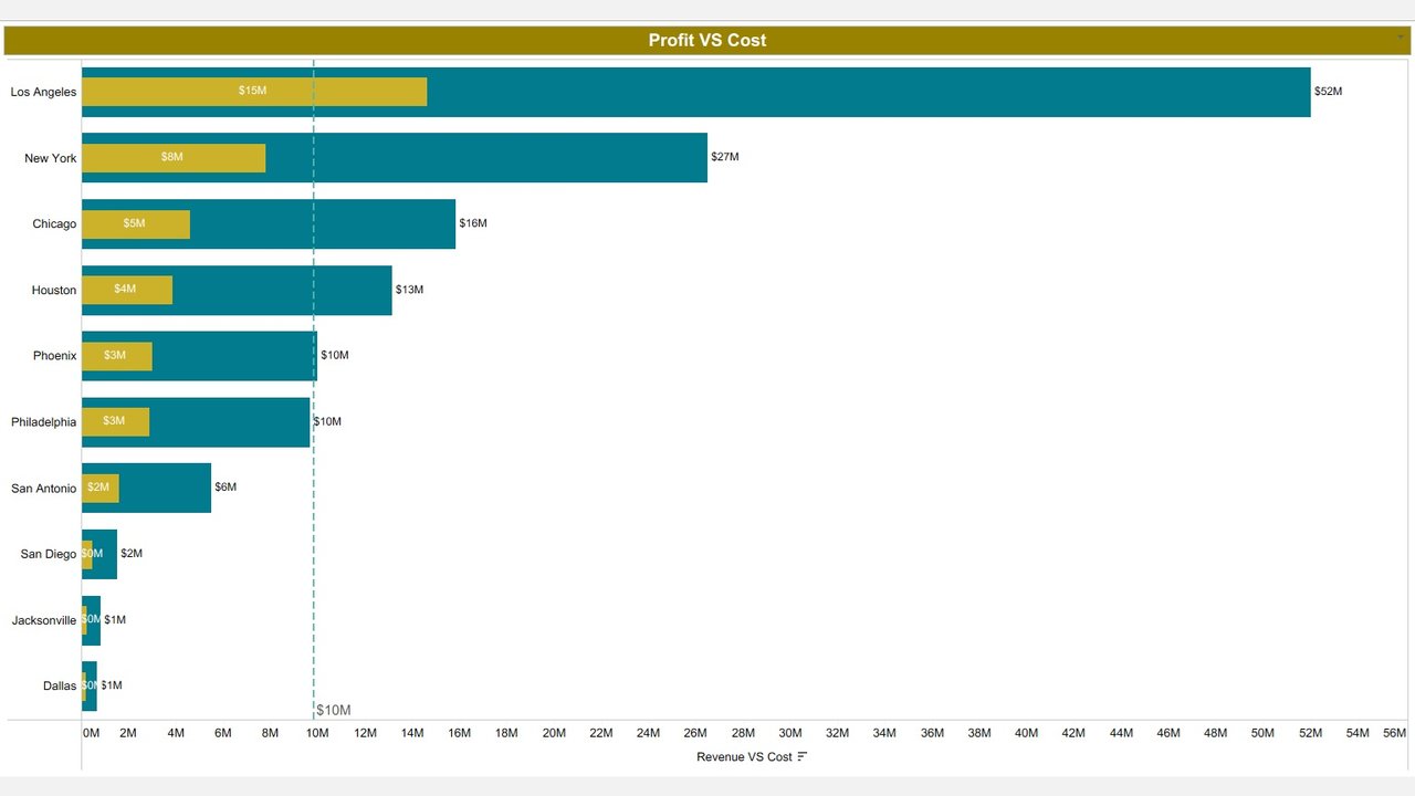
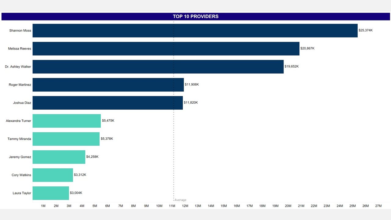
- A profit vs. cost view lists the top cities and providers by profit margin, so leadership can see where the return is and where costs can come down.
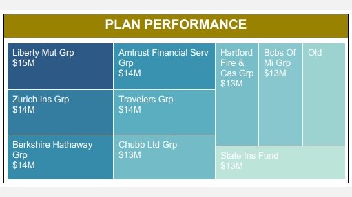
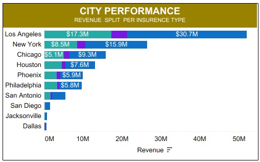
- Plan and city performance breaks revenue down by insurance plan and by major city, which feeds contract negotiations and market focus.
- Top providers and service groups are ranked by total revenue, profit margin and share of overall performance.
3. Pilot Rollout and Optimization
- A core group of financial analysts, billing managers and senior leaders used the dashboard first and checked data accuracy and chart clarity.
- Their suggestions refined the forecast model, added comparative KPIs and tightened the layout for faster reading.
- Training workshops and best-practice documentation followed, so every stakeholder can read the numbers and act on them.
Benefit: What Leadership Sees Now
1. Revenue Performance and Trend
Month by month comparisons show growth rates and seasonal swings. Year over year views show improvements or declines without waiting for a quarterly report.
2. Profit vs. Cost
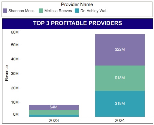
Bar charts show which locations and providers yield the highest profit margins, which guides investment and staffing decisions. A Top 3 Profitable Providers view spotlights the highest earners so their approach can be shared across the network.
3. Insurance and Plan Performance
Real-time monitoring of clean claim ratio (CCR) and net collection rate (NCR) helps reduce claim denials and keeps collections on track. Plan performance compares employer-sponsored plans, private insurance and workers’ compensation, showing the most profitable and the most demanding segments.
4. Revenue Ranking and Geography
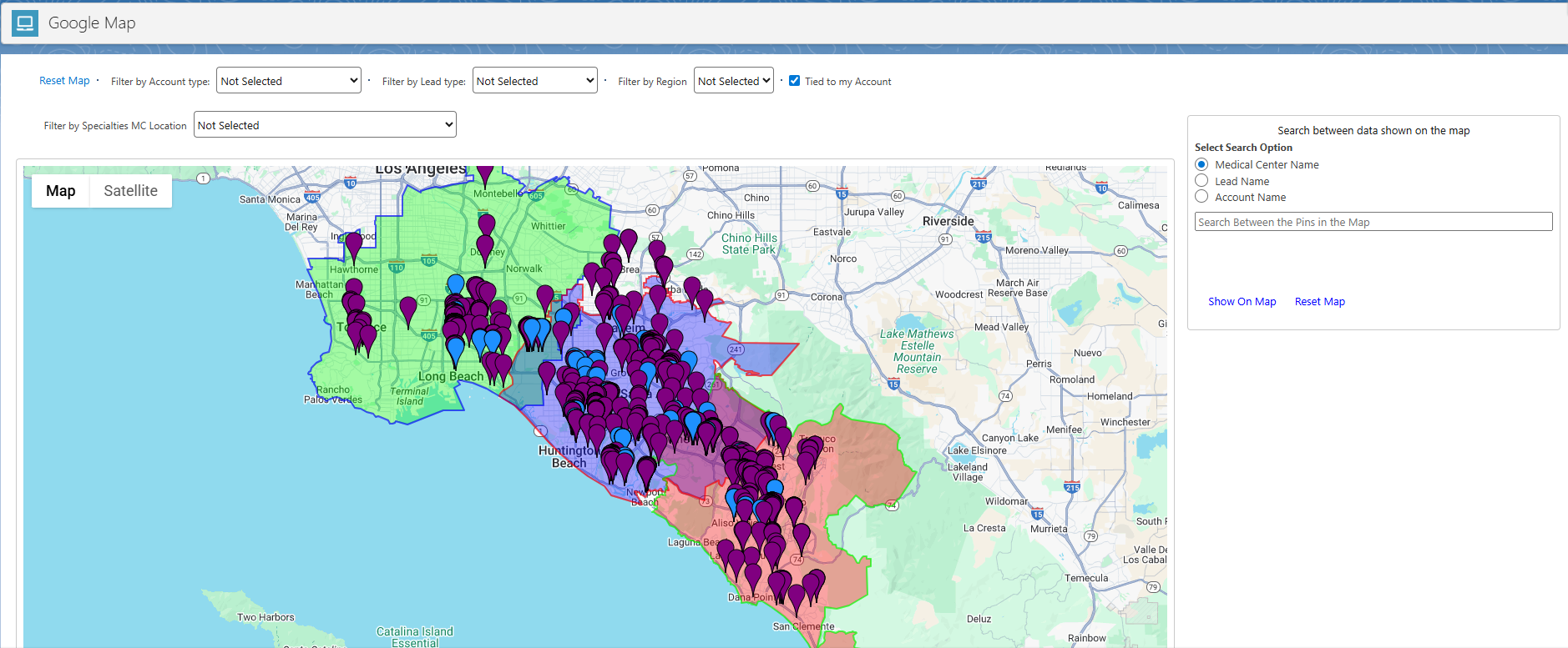
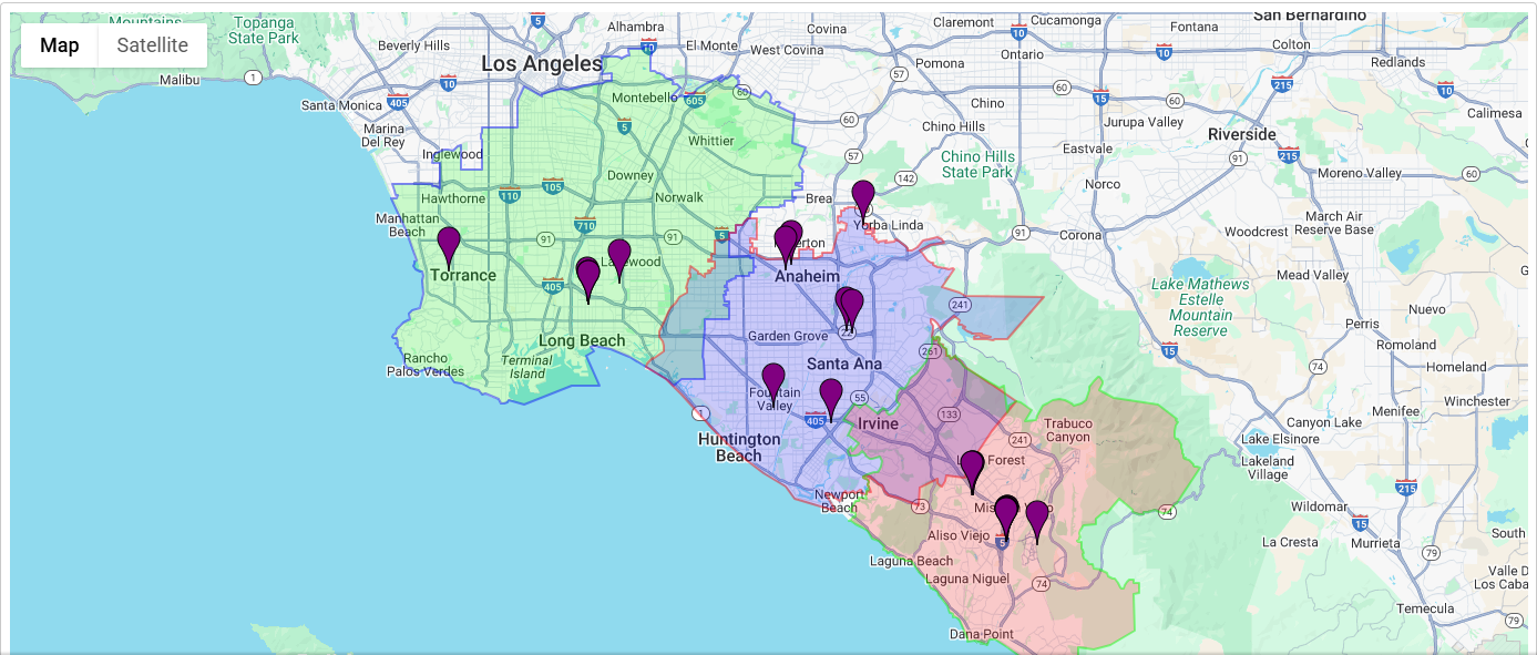
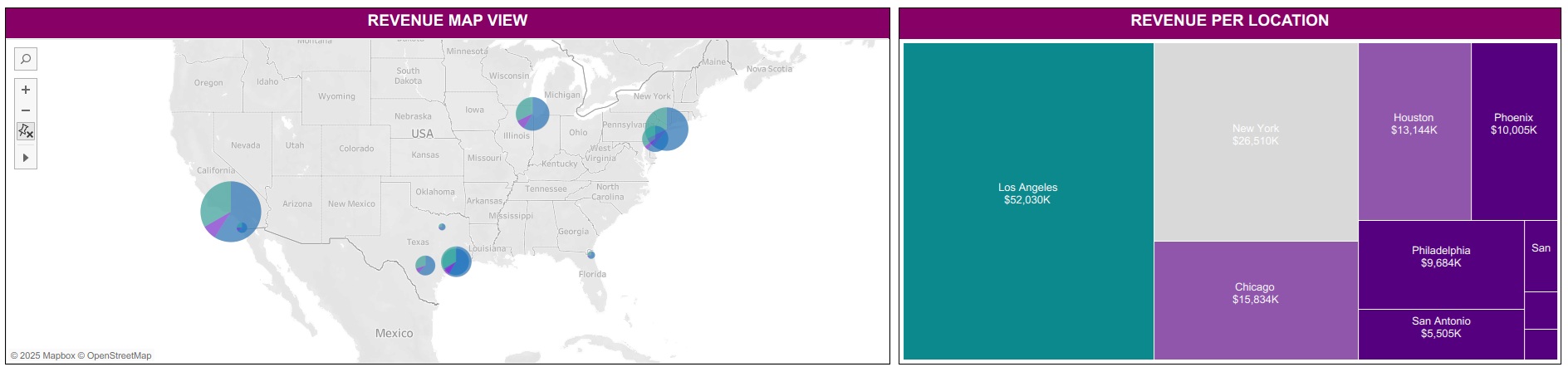
A table ranks service lines such as toxicology, diagnostic examination and medical imaging by total revenue and share of each insurance type. A map view spreads revenue across major cities, and a treemap splits it by clinic, so growth markets and weak regions stand out.
5. Forecasting and Planning
A three-month revenue forecast supports budgeting and operational planning. Scenario modeling lets stakeholders adjust claim volume or reimbursement rates and see the financial outcome before committing.
Conclusion: Clearer Numbers, Better Decisions
The network now runs its revenue cycle on live numbers. Watching NCR and CCR cut claim rejections and shortened collection times, which improved cash flow. Knowing which locations, providers and service lines earn the most steered reinvestment. Plan level insight gave the team better terms in contract negotiations, and the forecast lets leadership adjust budgets and plan expansion before the quarter ends rather than after. One dashboard replaced disconnected reports, and financial decisions now start from the same set of facts.
- Fewer claim rejections and faster collections.
- Reinvestment aimed at the locations, providers and service lines that earn the most.
- Contract negotiations backed by plan level insight into which insurance segments pay.
- Budgets and expansion plans built on projected revenue instead of estimates.
See Where Your Revenue Really Comes From

Mailing Address: 780 Lynnhaven Pkwy #400, Virginia Beach, VA 23452, United States
Email: inquiry@marratech.ai
Phone: +1-760-478-6770
North Macedonia Office
St. 11 Oktomvri, No.25,11th floor
1000, Skopje, North Macedonia